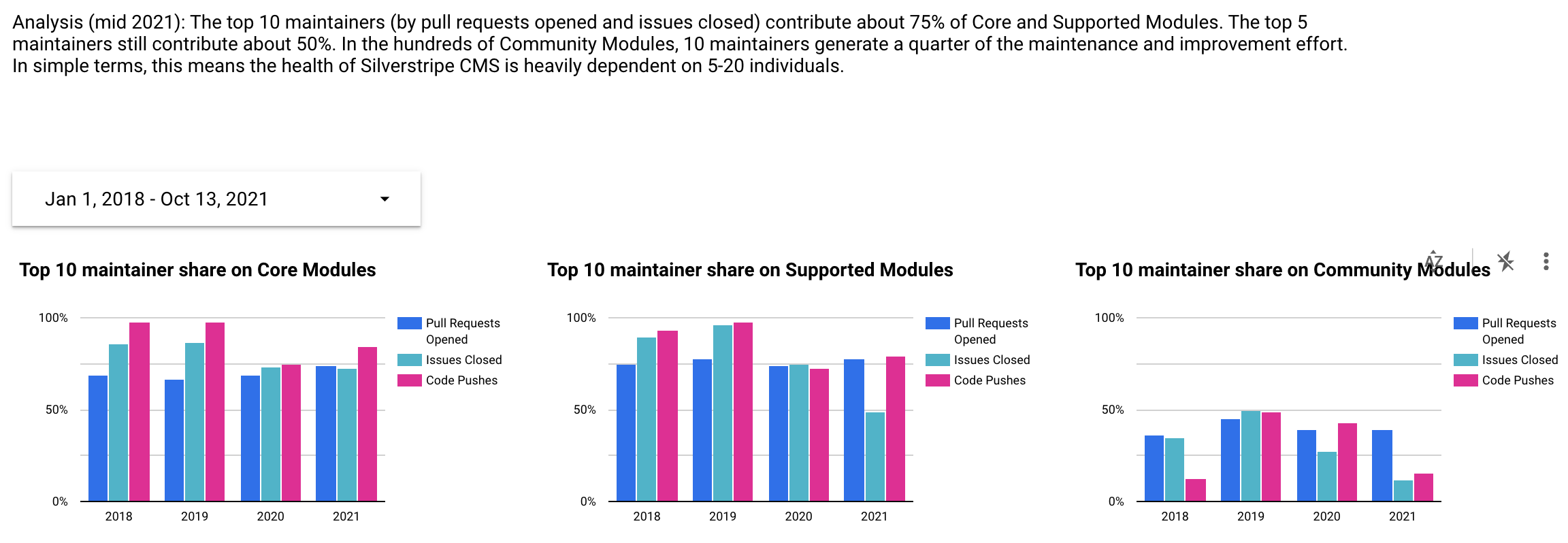
I’ve been a steward for a reasonably large open source community (Silverstripe CMS) for over a decade. My various roles working at the main sponsor of this community (Silverstripe Ltd) put me in a privileged position to talk to many awesome folks in this community, and influence the direction of the product. But along the way, I’ve also accumulated a lot of anecdotes, bias and gut feel about the “shape” of our community and its contributions. This is especially true when applied to a global community when looking out from our little “filter bubble” at the headquarters in Wellington, New Zealand.
In 2021, my interests in data wrangling and telling stories with it converged with a need for some clarity around the health of this community. Using Google BigQuery and Google Data Studio, I was able to surface these complex relationships to a wide range of people, with many surprising insights to myself and others.
This post focuses on the approach I have taken to gather and present this data set, rather than interpreting the results. Since it is 99% based on public data, the reports is free to view online (updated daily).
Github’s Data Hoarding
Github is the preferred tool for many interactions in open source communities, especially around code and issues. Thankfully, Github maintains githubarchive.org as a “long-term memory” of these interactions in Google BigQuery. Every time a pull request is opened, an issue is closed, or a comment is submitted, it creates a Github event. These events are tracked in a public “big data” set with all of their metadata, making it a treasure trove for insights.
Each entry will have a few pre-extracted columns and the remainder of the event as a big JSON payload:
[
  {
    "id": "16717181616",
    "type": "IssueCommentEvent",
    "created_at": "2021-06-09 23:23:02 UTC",
    "repo.name": "silverstripe/silverstripe-framework",
    "repo.id": "1318892",
    "actor.login": "chillu",
    "actor.id": "111025",
    "org.id": "379348",
    "org.login": "silverstripe",
    "payload": "{\"action\":\"created\",\"issue\":{\"url\":\"https://api.github.com/repos/silverstripe/silverstripe-framework/issues/7509\",\"id\":268206263,\"node_id\":\"MDU6SXNzdWUyNjgyMDYyNjM=\",\"number\":7509,\"title\":\"RFC: Avoid HTTPApplication for CLI\", /*...*/}}"
  },
  /* ... */
]
Ingesting the data
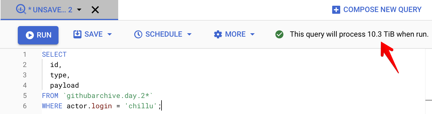
Google BigQuery can be introspected with convenient ANSI SQL:
SELECT
  id,
  type,
  -- ...
  payload
FROM `githubarchive.day.*`
WHERE actor.login = 'chillu';
The challenge is that under the hood, it’s a column-based database rather than row-based database, which was counterintuitive for me as a Postgres and MySQL user. A column-based approach scales to extremely large data sets, and provides fast reads across them while trading off transactional abilities. This makes it a tool of choice for a data warehouse and the resulting analytics rather than wiring it up to your web application.
The query example above would scan terabytes of data,
because of the inclusion of the (large) payload column and the lack of indexes in column-based storage.
Consequently, it would scan far less with a smaller number of columns but the same number of rows.
In the case of the Github Archive, the payload is where
all the interesting bits are. And in this service,
a query of this size would cost approximately $50USD to run once.
Since we only care about events from repositories related to Silverstripe, a one-off data copy into a separate BigQuery project makes the volumes more manageable at half a million extracted rows. From this point, new data is ingested daily into this append-only data set via a time bound scheduled query.
This query shows another common way to reduce data consumption: It limits the scans to a subset of the partitioned tables based on the date partition.
SELECT
  -- ...
FROM `githubarchive.day.2*`
WHERE
-- Date without the leading "2" (workaround to filter out "yesterday" table naming)
_TABLE_SUFFIX = SUBSTR(
  FORMAT_DATE(
    "%Y%m%d",
    DATE_ADD(CURRENT_DATE(), INTERVAL -3 DAY)
  ),
  2
)
AND repo.name IN (
  '3Dgoo/silverstripe-hcaptcha',
  '3Dgoo/silverstripe-instagram-scraper',
  -- ...
)
The source for all ~3k repos in the repo.name filter is addons.silverstripe.org,
which auto-discovers new repos based on their package name in PHP’s package manager (packagist.org).
At the moment, the discovered repos need to be manually extracted and added to the query body.
Shaping the data
One of the principles in modern data science is to strive for tidy data: Each variable forms a column, each observation forms a row, and each type of observational unit forms a table. This has served me well for buying a house with data-driven decisions with R, aggregating github issues for machine learning with Python and Pandas data frames, as well as many internal data warehouse challenges at Silverstripe Ltd.
As a first step, the ingested data is enriched with additional metadata, and columns extracted from the nested JSON payloads for easier analysis (see full query). This happens without changing the “shape” of the data/observation, and makes the additional columns useable for derived views.
SELECT
c.*,
JSON_EXTRACT_SCALAR(payload, '$.action') as action,
JSON_EXTRACT_SCALAR(payload, '$.ref_type') as ref_type,
EXTRACT(YEAR FROM created_at) AS created_at_year,
IF(sm.github IS NOT NULL, TRUE, FALSE) AS is_supported_module,
sm.isCore AS is_core_module,
CASE
    # Core modules are a *subset* of supported modules
    WHEN sm.isCore THEN 'Core Module'
    WHEN sm.github IS NOT NULL THEN 'Supported Module'
    ELSE 'Community Module'
END AS module_category
-- ...
FROM `community` c
LEFT JOIN `supported_modules` sm ON c.repo_id = sm.githubId
With these foundations, we can dig into the interesting details.
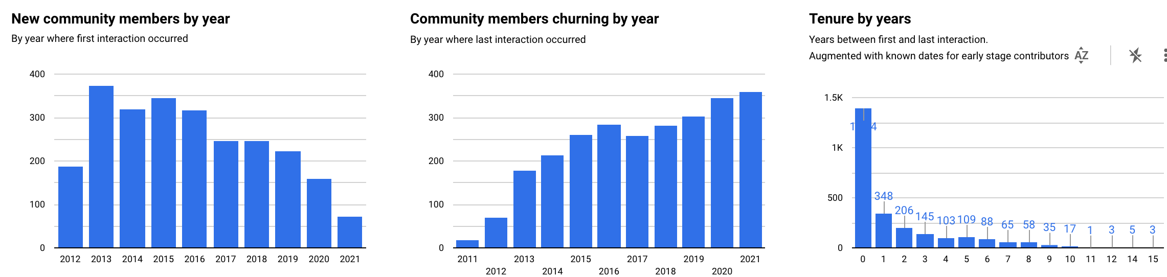
Here’s an abbreviated example showing first and last interactions
of a specific user (“actor”), across all repositories.
Common table expressions through WITH
keep things readable, and window queries
make it extremly concise to slice data along a group of rows.
This view is used to calculate community tenure trends as well as “churn”.
WITH
actor_interactions AS (
    SELECT
        actor_login,
        COUNT(id) OVER(PARTITION BY actor_login ORDER BY created_at ASC ROWS BETWEEN UNBOUNDED PRECEDING AND UNBOUNDED FOLLOWING) AS interaction_count,
        FIRST_VALUE(created_at) OVER(PARTITION BY actor_login ORDER BY created_at ASC ROWS BETWEEN UNBOUNDED PRECEDING AND UNBOUNDED FOLLOWING) AS first_interaction_date,
        LAST_VALUE(created_at) OVER(PARTITION BY actor_login ORDER BY created_at ASC ROWS BETWEEN UNBOUNDED PRECEDING AND UNBOUNDED FOLLOWING) AS last_interaction_date,
        ROW_NUMBER() OVER(PARTITION BY actor_login ORDER BY created_at ASC) AS _rn,
    FROM `community_extra` c
    WHERE
        actor_login IS NOT NULL
        -- Only count "substantial" interactions. There's a lot of noise from single event users, e.g. watching a single repo
        AND type IN ('PushEvent', 'IssueCommentEvent', 'IssuesEvent', 'PullRequestEvent', 'PullRequestReviewEvent', 'PullRequestReviewCommentEvent', 'CommitCommentEvent')
    ORDER BY first_interaction_date ASC
),
actor_interactions_normalised AS (
    SELECT
    -- ...
    FROM actor_interactions
    WHERE _rn = 1
)

SELECT
    actor_login,
    interaction_count,
    first_interaction_date,
    last_interaction_date,
    DATE_DIFF(DATE(last_interaction_date), DATE(first_interaction_date), YEAR) AS active_years
FROM actor_interactions_normalised
Telling the story
I find that the trick with shaping data is knowing when to stop. While its convenient to slice and aggregate via SQL, at some point you’ll try to predict all the permutations of how the data is analysed. It needs to be shaped just enough to be understandable by other users (potentially non-technical), and in small enough volumes to enable efficient further shaping in more approachable tools such as business intelligence software. This is where Google Datastudio comes in as a reports creator and viewer.
Complex shaping such as the actor interaction example from above keep workloads light in the reporting view, while producing useful views on semi-raw data.
By adding metadata such as “is supported module” to each event without grouping on this dimension in SQL, the reporting view can filter this on the fly based on interactive user selections in permutations that are hard to predict or prescribe.
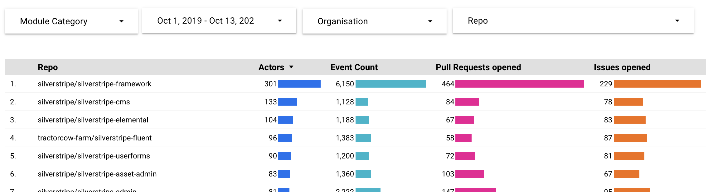
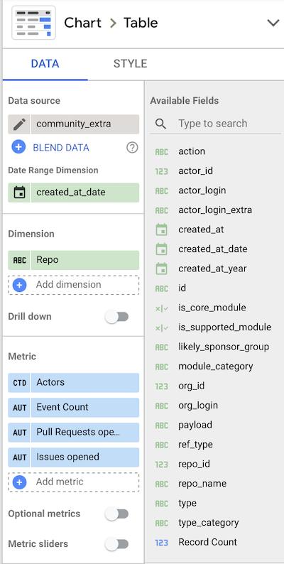
Google Datastudio is one of many tools that can be used for this purpose, but it obviously works really well with Google BigQuery. The schema of any tables and views is exposed automatically, with sensible defaults on dimensions and metrics. This is most of the setup required to drive the filterable table shown above.
By combining some inline commentary with auto-updated and interactive data, these reports become powerful tools to tell an overarching story, but also for this story to evolve over time. Community members will look at this through a different lens than their sponsors (often the agencies they work for). Newcomers will dig for different insights than old hats.
Conclusion
In this particular situation, I was fortunate to be embedded in a business and community where I had both the need for data-driven insights, as well as the resources and skills to get the required foundations in place. 90% of “data science” seems to be the retrieval and shaping of data, rather than its interpretation. It’s often not the most glamorous work, but worth it to tell the story. This is especially true when it leads to conversations with folks who wouldn’t be in a position to get those insights themselves (due to lack of access or technical skills).
I’d like to thank Dries Buytaert, the “founding father” of Drupal (a CMS in friendly competition with Silverstripe). He’s built a system over the years to track contributions in their community, summarised in annual who sponsors Drupal posts. This took vision and tenacity, where the resulting data analysis is just the tip of the iceberg. And it has inspired me to seek out (albeit more limited) insights in our little corner of the open source ecosystem.
Disclaimer: Unfortunately I can’t make the source data derived from gharchive.org available to provide full transparency, due to limitations on Google BigQuery permissions. I would have to work with Google to make it a (sponsored) public data set. You’re welcome to derive a very similar data set based on the queries used, or contact me to collaborate and clarify.